
Häagen Dazs
For the popular ice cream brand, I’ve rebranded Häagen Dazs with new packaging and a new website. Häagen Dazs is a made-up word created by the founder, and in that spirit, I took inspiration from Swiss design to bring about the playful & creative nature of Häagen Dazs.

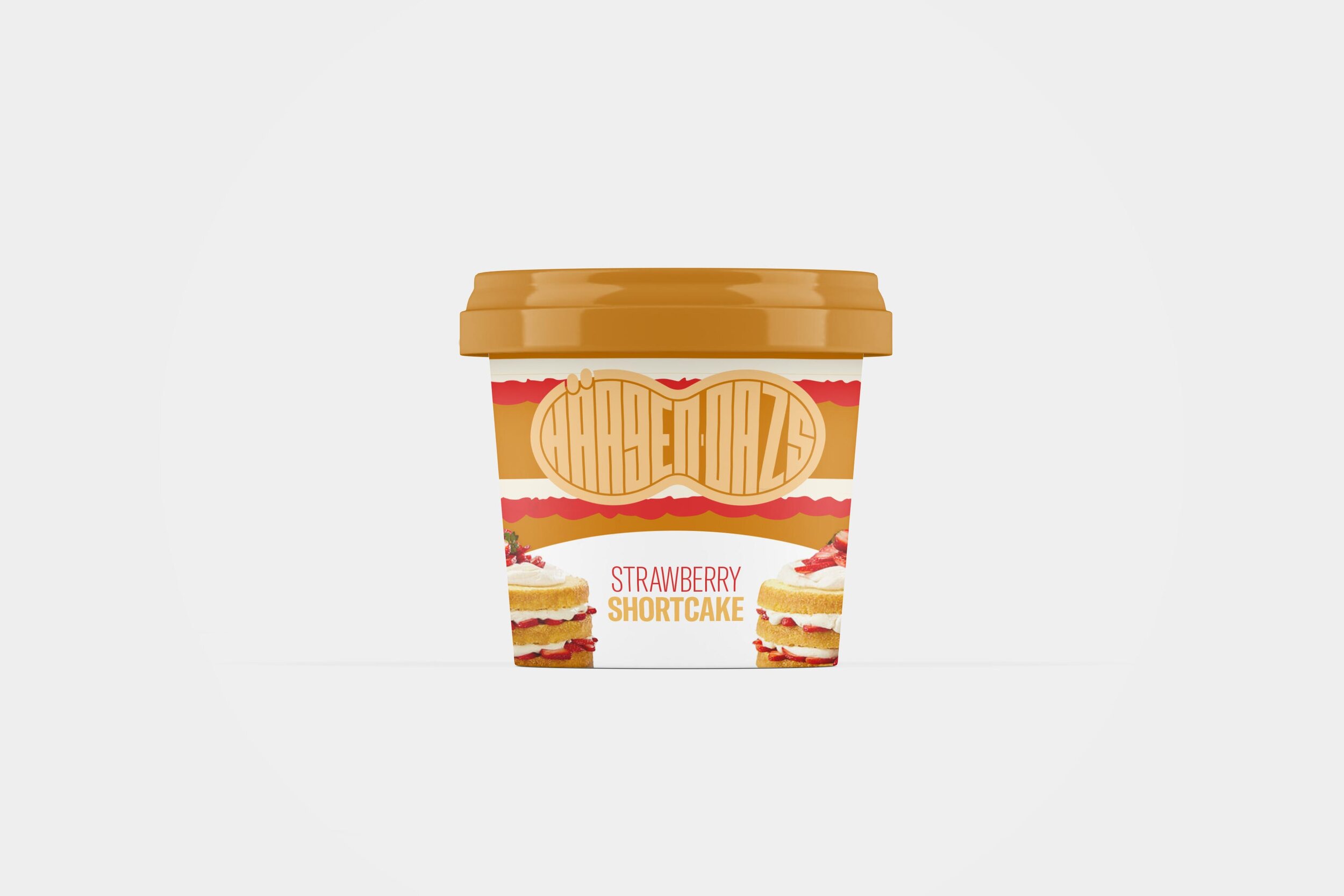
The New Logo
The direction for the logo not only drew from Swiss design, but utilized it in a way that was unique to the Häagen Dazs brand. The logo is in the shape of their new custom designed ice cream scoop, therefore, recreating a recognizable brand with purpose.


Color Palette
The best part of Häagen Dazs is their immense & ever-changing array of flavors. It would be counterintuitive to limit the brand to a few colors. The palette will be as fluid as the brand’s products, changing as often as necessary in order to represent the product flavors.


Brand New Website
Here, I have created a website for the new Häagen Dazs brand. Now, it better reflects their vibrant and colorful rebrand, displaying its endless design system and ease of function.