
Dole
For Dole, I’ve reimagined the logo and packaging. The new colorful & refreshing look centers around enjoying every drop of Dole juice.
The New Logo
When creating a refreshing new look for Dole, one of the largest fruit & juice distributers in the world, it is important to change with an abundance of intention. This look focused on the drop-shaped “o” creating a transparent window peering into the thing that matters most: their delicious, colorful, and fresh fruit.

Color Palette
To highlight the vibrant array of earth’s most interesting natural colors, I have created a exciting and bright palette that speaks to all things fruit.

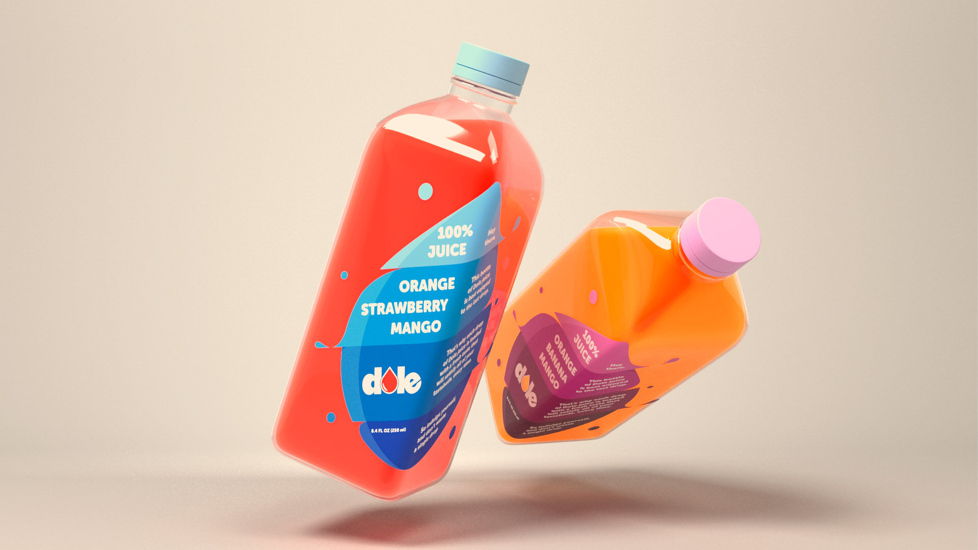
The Drop
With the exciting changes used in the new logo comes a need to refresh the packaging. Using a conventional label did not seem fitting for such an exciting new look. So the label reflects the purpose of the rebrand. It is all about the drop.


Let the World Know
Copywriter: Emilie Moss